This is the third article from Power BI Designer series. To fully understand this article you need to read my previous posts “Build Your First Report in Microsoft Power BI Designer Part 1, Basics” and “Build Your First Report in Microsoft Power Bi Designer Part 2, Make it More User Friendly” as well. In this article I explain how to publish your predefined reports on www.powerbi.com website which is free. So after publishing the reports, you can create flashy reports very easily. By very easily, I mean it! Creating dashboards is even easier than dragging report objects and dropping them somewhere on the tool! I’ll explain how that is possible. Actually, it is all about the awesomeness of the online BI Designer.
Frist of all, you need to create an account in www.powerbi.com. Unfortunately, you’ll need to have a corporate email address that means you’re NOT allowed to use free email accounts like MSN, Hotmail, Yahoo, and Gmail and so on. But, if you’re a student with a valid university email address or if you’re an employee with a corporate email address, then you’ll be fine.
Let’s start.
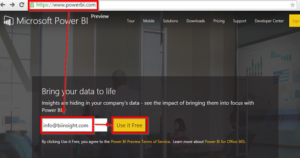
- Browse www.powerbi.com
-
Enter your valid email corporate or university email address then click on “Use it Free”
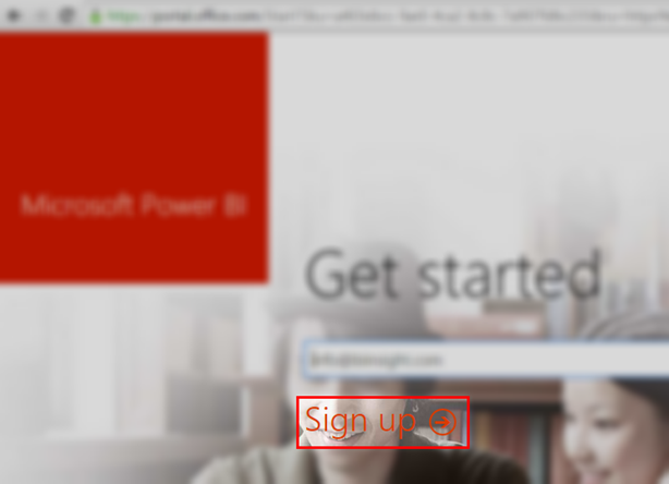
- Click “Sign Up”. Then you’ll receive a confirmation email.
-
Complete the confirmation process by entering your name and password then click “Start”
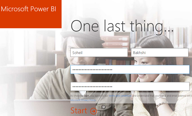
-
Online Microsoft Power BI setup is now completed
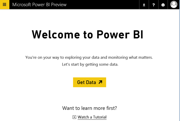
- You can do lots of things here, but, for now you need to concentrate on creating your first dashboard. So, click on “Get Data”.
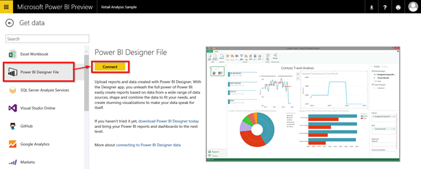
- Click “Power BI Designer File” from the left pane
-
Click “Connect”
- Click “Browse” to browse your computer and choose your predefined reports. Remember, it was stored as a *.pbix file.
-
Click “Connect”
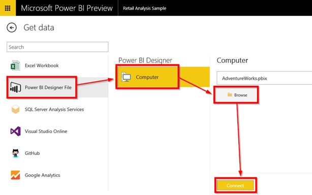
-
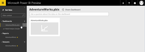
As you can see “AdwentureWorks” is added to three sections on the left pane.
-
Dashboards: You can see all of your dashboards here. You can open each dashboard by clicking on it. You can also create a new dashboard by clicking on the “+” button on the right side of this part
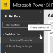
- Reports: In this part, you can see all the reports you created regardless of the dashboards. Likewise, you can create new reports by clicking on the “+” button on the right of this part
- Datasets: You can navigate existing datasets or create new datasets in this section
-
That’s it! As you can see the predefined report is added to the “AdwentureWorks” dashboard. You can click on the report to browse it.
NOTE:
Whatever you can see on the middle pane are the reports added to the dashboards. As stated before, you can navigate between the dashboards by clicking on their names from the dashboard section on the right pane.
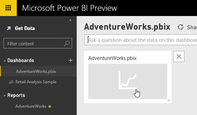
So we already have a dashboard which includes the report we created before. To open the report you can easily click on it.
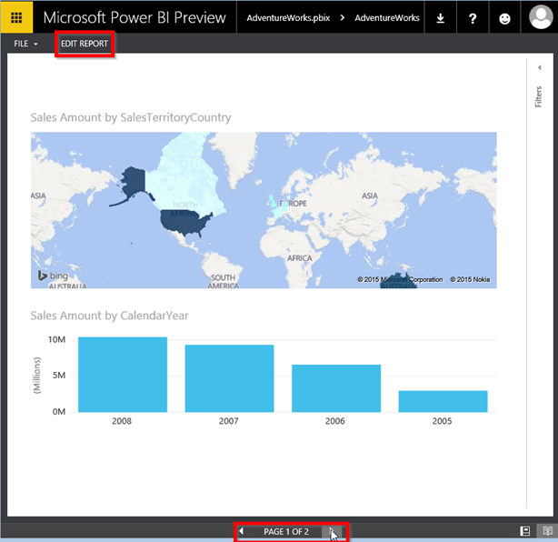
You can navigate between the pages or even edit the report online which is awesome.
Now we want to go a step further and make our dashboard more usable.
- Click on “Edit Report”
- As you can see you can either edit the report by modifying the existing charts, adding new pages to the report, creating new charts or PIN an existing chart to the dashboard
-
To pin an existing chart to the dashboard click on the pin button
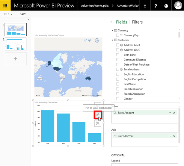
- Navigate to page 2 of the report and pin another chart to the dashboard
- Click “Save”
-
Click on Microsoft Power BI
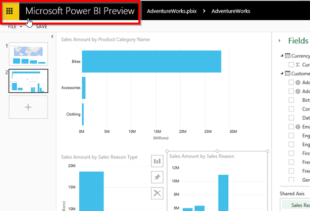
-
As you can see the charts are added to the dashboard. Now you can move the charts to make the dashboard tidier.
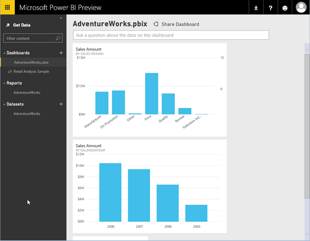
- Clicking on each chart will navigate you to the exact page that the chart belong to
Alright! Now we reached to the existing part which is creating some new charts interactively! As I stated before, it is even easier that dragging and dropping predefined charts to somewhere on the screen to create a flashy dashboard.
To create a new chart you just need to type some keywords of what you want to see on the chart in the “Ask a question about the data on this dashboard” box. At this stage you’re actually using Power BI Q&A component of Power BI.
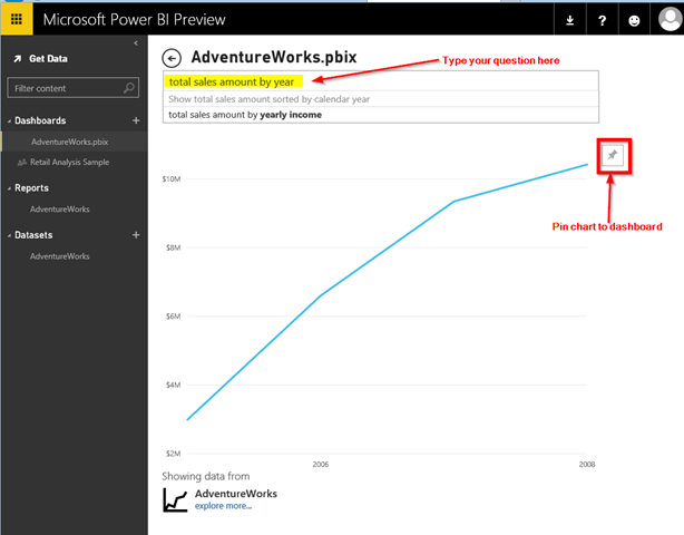
Surprise! Your chart is ready! Do you like to keep it on the dashboard? So just pin it.
Let’s make another chart.
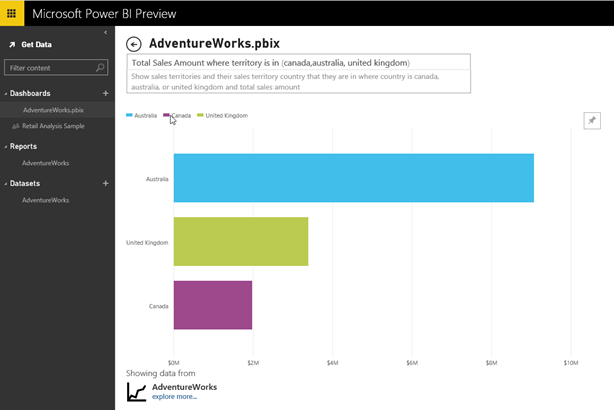
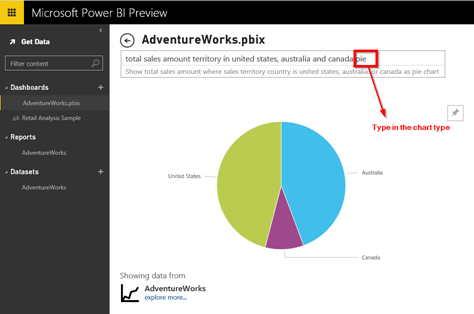
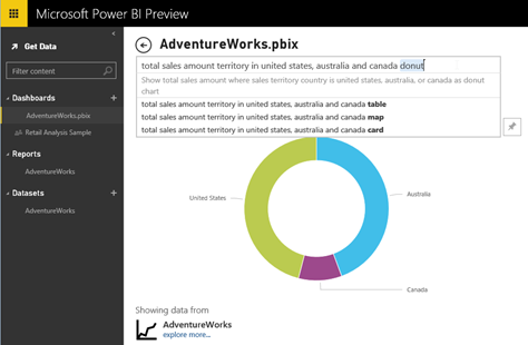
You can also change the chart type easily by including it in your question.
After pinning the chart to the dashboard if you don’t like the default chart name, click on the “Edit Title” button and type in whatever describes the chart better.
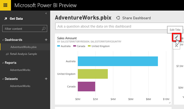
Click on AdwntureWorks from the “Dashboards” section on the right pane and move the new chart. You can resize the other charts and make a nice tile of charts.
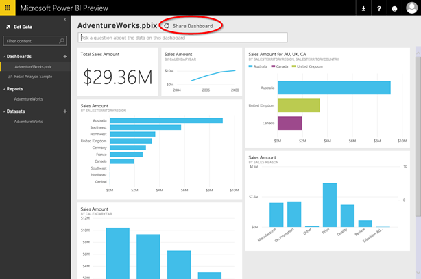
You can even share the dashboard with others inside your organisation.
In the next post I’ll explain how to access your Power BI dashboard from you ISO device.
Discover more from BI Insight
Subscribe to get the latest posts sent to your email.
