


Are you a Power BI developer who has suddenly been asked to build reports on top of Dynamics 365 Business Central sales data?
The request normally sounds quite simple. We need sales, gross profit, gross margin, customer performance, product performance and perhaps some trends for the executives. But before building any visuals, we need to understand the Business Central data. Which tables do we need? How are they related? What filters should we apply? And what do the values actually mean? These are the questions I want to answer first.
This is a point that I cannot emphasise enough. If we do not understand the source data schema, picking a bunch of tables and loading them into Power BI will not magically give us a good analytical model.
In this post, I walk through the solution from the accompanying video. In the recording, I start from a blank Power BI Desktop file and build it from scratch. We connect to Dynamics 365 Business Central, use the APIs, select the tables we need, clean the data in Power Query, build the data model, create the measures and finally use Copilot in Power BI to generate the first version of the report pages.
Watch the full video on my YouTube channel here:
Listen to the AI generated podcase here:
A big shout-out goes to Tharanga, my fellow Microsoft Business Applications MVP, who helped me understand the Business Central data model. Also a big thank you to Manmohan, a Business Central expert who knows the schema inside out. Without that Business Central knowledge, I would have spent a lot more time figuring out which tables and columns I actually need.
The Data Model Comes First #
Check out the video on YouTube at 0:21
Before we get started, there is one point I would like to raise: data modelling is still the key part of Power BI.
Business Central provides a whole lot of different APIs and they expose the data in different ways. Not every API exposes the same data either, so even before we get into Power Query, we need to know what we are connecting to and why.
We need to know which tables to select, which filters to apply and how to create the relationships. Without that understanding, it is hard to know whether the report is giving us the right answers.
For this example, I use Standard APIs v2.0 and the following four Business Central tables:
customersitemsitemLedgerEntriesitemCategories
That is pretty much it. With these four tables we can already answer a whole lot of useful questions about sales.
Having said that, this is a demo model. Your real Business Central implementation can have different requirements, extensions and custom APIs, so do not take these four tables as a universal recipe for every Business Central reporting project.
Connecting Power BI to Dynamics 365 Business Central #
Check out the video on YouTube at 2:21
I start with a new Power BI Desktop session. To follow along, select Get Data, search for Business Central, select the Dynamics 365 Business Central connector, then click Connect.
If you have connected to the Business Central instance before, Power BI may automatically connect using the stored credentials. Otherwise, you have to authenticate first and then access the environment.
Navigating to Standard APIs v2.0 #
Check out the video on YouTube at 3:20
In my example, I select the SANDBOX-DEV environment, expand the CRONUS NZ company, then open Standard APIs v2.0.
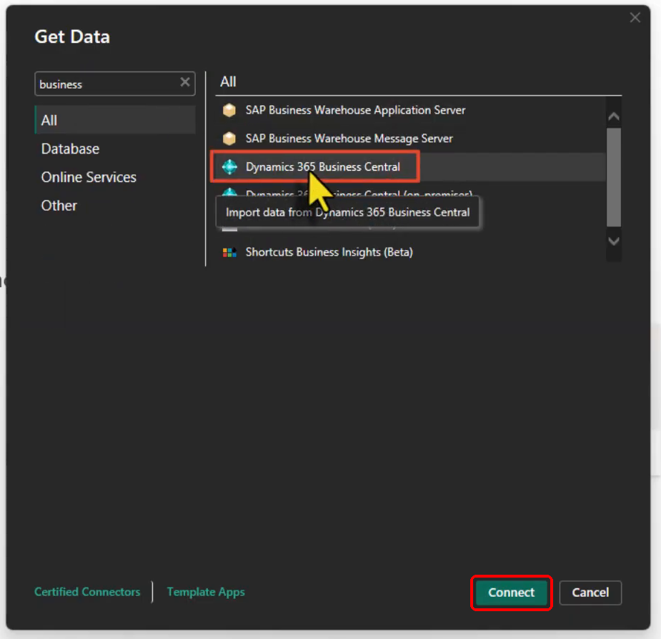
Dynamics 365 Business Central selected in the Get Data dialog.
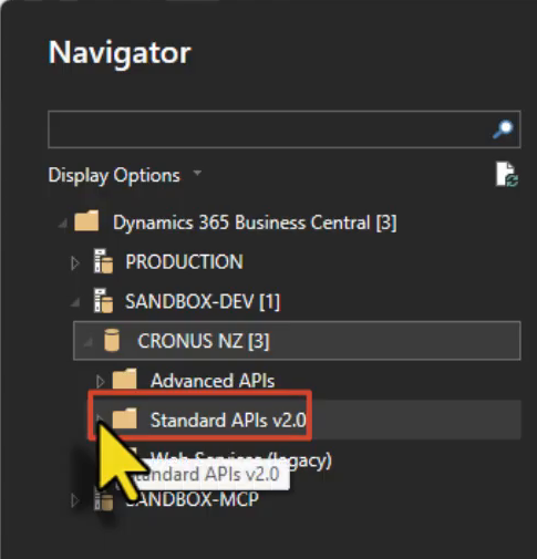
Standard APIs v2.0 under SANDBOX-DEV and the CRONUS NZ company.
Selecting the Tables for the Sales Model #
Check out the video on YouTube at 3:37
As you can see in the Navigator, there are a whole lot of tables available. This is exactly where having some understanding of the Business Central schema becomes very important.
If you do not have that knowledge yourself, I strongly advise you to speak with someone who does. It might be a Business Central consultant in your organisation, someone from your implementation partner, or whoever understands how your Business Central solution has been configured.
You can of course use documentation and Copilot to help you identify the tables as well, but keep in mind that the API you are connecting to matters because not all data is exposed through all APIs.
For this walkthrough, I select the following four tables:
| Table | Purpose in this model |
|---|---|
customers | Customer information used to analyse sales by customer and other customer attributes |
items | Product or item information |
itemLedgerEntries | The transactional table containing sales and purchase related entries |
itemCategories | Category information used to analyse items by category |
The itemLedgerEntries table is the important one here because it keeps both sales and purchase related entries. We will trim it down to the sales data shortly.
After selecting the four tables, I click Transform Data rather than loading everything straight into the model.
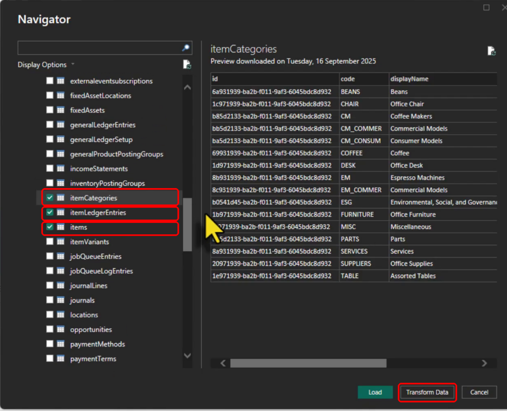
Selecting the Business Central tables before opening Power Query. The customers table is selected above the visible part of the list.
Cleaning the Business Central Data in Power Query #
Check out the video on YouTube at 5:26
Power Query Editor opens and from here we can rename columns, change data types, remove the things we do not need and make the data more suitable for reporting.
I do not want to overcomplicate this part. The main objective is to keep the model clean and only carry the data that is useful for our reporting requirements.
Rename the Columns to Something More User Friendly #
Check out the video on YouTube at 5:38
Several of the API tables expose a column called displayName.
Having displayName in multiple tables is not really helpful when we get into the model and start building reports. So I rename those fields to something that explains what they actually are, for example customer name, item description and category name.
It is a small thing, but friendly naming makes a big difference later. This is useful for us as developers, for the report authors, and also for any AI experience that needs to understand the semantic model.
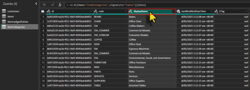
The generic displayName field in itemCategories before renaming it.
Remove the Columns We Do Not Need #
Check out the video on YouTube at 6:27
I normally remove the columns that we do not need for the model or the report. There is no benefit in loading every column just because it is available.
In the customers table in my demo, I have 38 columns and only five rows. Obviously the five rows are just because of the sample data, but having 38 columns is a good reminder that we should not keep every field just because the API gives it to us.
For example, there is an id column which is a GUID. In this particular model it is not contributing to any of the relationships and I am not using it in the report, so I do not need to keep it.
One little tip here is to use Choose Columns on the Home ribbon in Power Query Editor. Instead of selecting lots of columns one by one and removing them, I normally find it easier to choose the columns I want to keep and untick the rest.
I repeat the same process for the other tables.

Choose Columns on the Power Query Home ribbon.
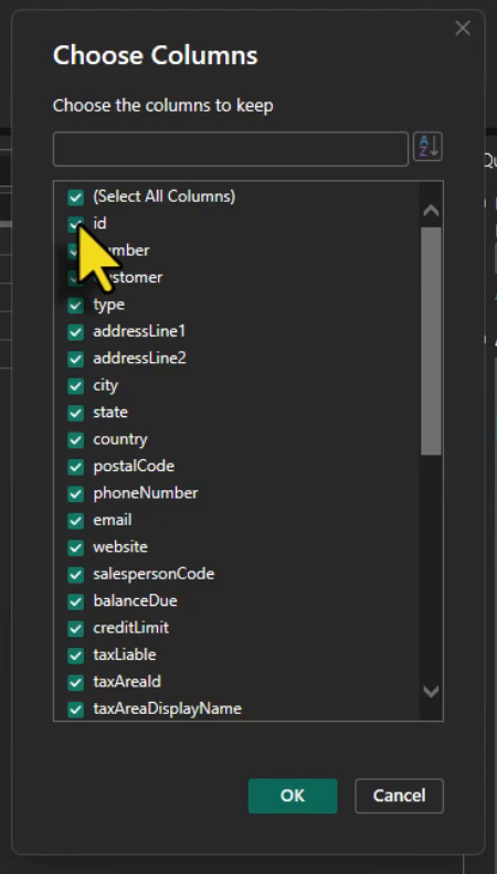
Choose Columns lets us select the customer fields to keep.
Now, there is an important point here that comes back later in the video. A column that looks unnecessary at this stage may become necessary when we start creating measures. That happens to me in this demo as well, and we will fix it when we get there.
Filter Item Ledger Entries to Sales #
Check out the video on YouTube at 8:08
Here is another important point.
itemLedgerEntries contains more than just sales. For this report I only want to analyse the sales transactions, so I filter the entryType column and keep Sale only. This is the sales entry type shown in the recording.
That puts a filter on top of the item ledger entries query and gives us the transactional data we need for this sales model.
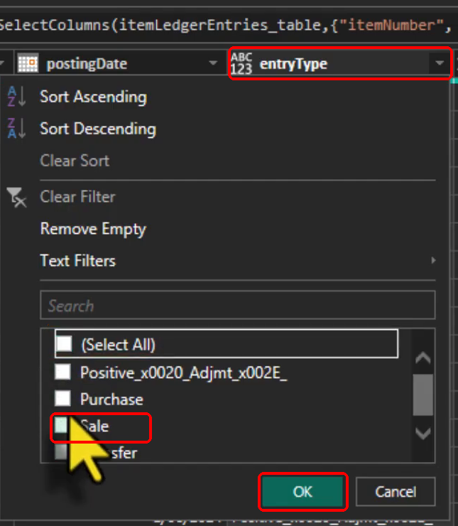
Filtering entryType to the Sale entry type used in the recording.
I do not rename all the tables in the video, but in a real project you may want to rename them to something more user friendly as well.
Do Not Leave Columns with the Any Data Type #
Check out the video on YouTube at 9:05
Another best practice is to avoid leaving columns with the Any data type.
In Power Query, the ABC123 icon represents Any. We can of course click the data type icon for each column and change them one by one, but if you have many columns that becomes a little cumbersome.
One option worth knowing about is Transform > Detect Data Type, as the command is labelled in the recording.
Power Query will try to detect the correct types based on the source and the values that it can see. It is not perfect, so I would not blindly trust it, but it can save some time. I still go through the important columns and make sure they are correct.
I pay particular attention to the columns used in relationships. The data types must be compatible on both sides, so I check that the Business Central key columns are Text.
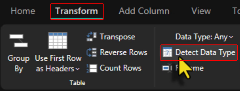
The Detect Data Type command on the Transform ribbon.
Once the transformations are ready, I click Close & Apply and load the cleaned data into the model.
Building the Business Central Data Model #
Check out the video on YouTube at 10:55
Now we have all the tables loaded and it is time to create the relationships.
For this example, itemLedgerEntries is our fact table. I assume you are familiar with the concept of fact and dimension tables and dimensional modelling. If not, there are many resources available online and I have also covered this topic in my book, Expert Data Modelling with Power BI.
The relationships I create in the video are:
itemCategories[code]toitems[itemCategoryCode]items[number]toitemLedgerEntries[itemNumber]customers[number]toitemLedgerEntries[sourceNumber]
There are multiple ways of creating relationships in Power BI. For this example I just stick with drag and drop, then confirm the selected columns in the relationship dialog before saving it.
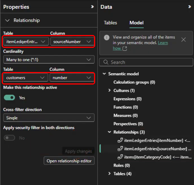
The customer relationship uses itemLedgerEntries[sourceNumber] and customers[number], with many-to-one cardinality and a single filter direction.
The itemCategories table sits behind the items table instead of connecting directly to itemLedgerEntries. So if we want to be very precise, this is not a perfectly flattened star schema. That is absolutely fine for what I am trying to show here. The important thing is that the relationships make sense and the filter paths work the way we expect.
Adding a Date Table #
Check out the video on YouTube at 12:58
In dimensional modelling, we almost always need a proper Date table.
We normally want to analyse the data by year, month, quarter and what not. A Date table gives us those attributes in one place.
Business Central already has a date table available and you are more than welcome to use it if it works for your requirements. For this specific example I do not use that table because the date range is much larger than what I need, and there is no point bringing a very large date range into this small sample model.
There are also multiple ways to create a Date table. We can create a calculated table in the model using DAX, or generate it in Power Query. In this example I create it in Power Query.
My sample data sits between 1 January 2023 and 31 December 2025, so I deliberately create a Date table for that range.
I create a Blank Query, rename it to Date, open Advanced Editor and paste the following M code. It follows the query shown in the recording:
let
    StartDate = #date(2023, 1, 1),
    EndDate = #date(2025, 12, 31),
    DateList = List.Dates(
        StartDate,
        Duration.Days(EndDate - StartDate) + 1,
        #duration(1, 0, 0, 0)
    ),
    DateTable = Table.FromList(
        DateList,
        Splitter.SplitByNothing(),
        {"Date"},
        null,
        ExtraValues.Error
    ),
    AddYear = Table.AddColumn(
        DateTable, "Year", each Date.Year([Date]), Int64.Type
    ),
    AddMonthNo = Table.AddColumn(
        AddYear, "MonthNo", each Date.Month([Date]), Int64.Type
    ),
    AddMonth = Table.AddColumn(
        AddMonthNo, "Month", each Date.ToText([Date], "MMMM"), type text
    ),
    AddQtrNo = Table.AddColumn(
        AddMonth, "QuarterNo",
        each Number.RoundUp(Date.Month([Date]) / 3), Int64.Type
    ),
    AddQtr = Table.AddColumn(
        AddQtrNo, "Quarter",
        each "Q" & Number.ToText([QuarterNo]), type text
    ),
    AddDay = Table.AddColumn(
        AddQtr, "Day", each Date.Day([Date]), Int64.Type
    ),
    #"Changed Type" = Table.TransformColumnTypes(
        AddDay, {{"Date", type date}}
    )
in
    #"Changed Type"
The dates above are specific to the data that I use in the video. In a real solution, you need to choose the range that makes sense for your model.
As a general modelling principle, I normally want the Date table to start from 1 January of the required starting year and continue to 31 December of the required ending year. This gives us complete calendar years for time intelligence and the date attributes we use in reports.
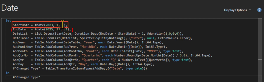
The Date query in Advanced Editor, bounded from 1 January 2023 to 31 December 2025.
After loading the Date table, I create the relationship between Date[Date] and itemLedgerEntries[postingDate].
At this point I also check the data types on both sides of all the relationships. The date fields are Date and the Business Central key fields used in the other relationships are Text.
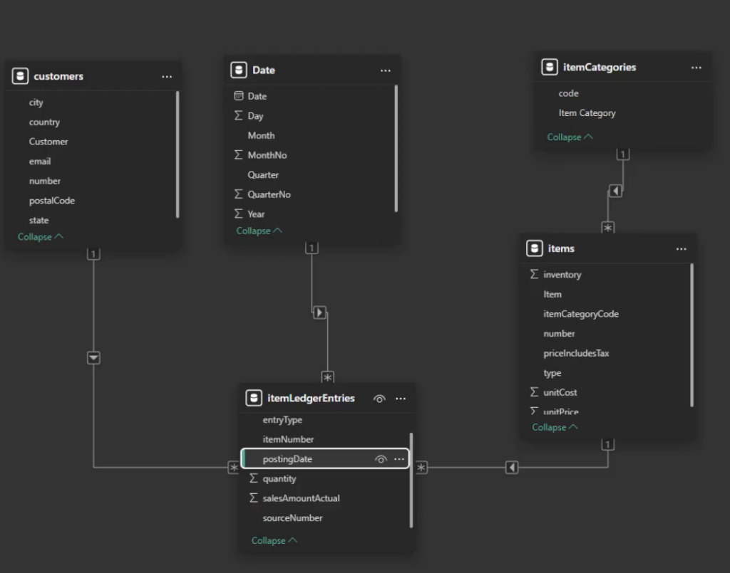
The completed model from the recording, with Date and the four Business Central tables.
Creating the Sales Measures #
Check out the video on YouTube at 15:56
With the relationships in place, it is time to create the measures.
I first create a couple of them in the usual way using New measure, just to show the process.
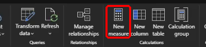
New measure on the Desktop ribbon.
For example:
Total Sales Amount =
SUM ( 'itemLedgerEntries'[salesAmountActual] )
And:
Total Cost Amount =
SUM ( 'itemLedgerEntries'[costAmountActual] )
The batch definitions linked below include the following measures:
Total Quantity =
SUM ( 'itemLedgerEntries'[quantity] )
Gross Profit =
[Total Sales Amount] + [Total Cost Amount]Gross Margin % =
CALCULATE (
DIVIDE ( [Gross Profit], [Total Sales Amount] ),
ALL ()
)Sales per Customer =
DIVIDE (
[Total Sales Amount],
DISTINCTCOUNT ( 'customers'[number] )
)There are two details to keep in mind in these definitions. Gross Profit adds the cost amount because costs have a negative sign in this sample. If your source stores costs as positive values, you need to adjust the calculation. Also, the batch Gross Margin % measure uses ALL (), so it removes the report filters. For a margin that follows the current filter context, use DIVIDE ( [Gross Profit], [Total Sales Amount] ) without that filter removal.
Now, I do not want to sit there and create 50 measures one by one. This is where DAX Query View becomes very handy.
Creating 50 Measures with DAX Query View #
Check out the video on YouTube at 18:05
In the video I already have the measure definitions prepared. I open DAX Query View, paste the definitions and Power BI detects 50 measures in the script.
I then select Update model with changes, confirm the operation, and those measures are added to the semantic model.
If you already have the measure definitions prepared, this saves a lot of repetitive work. I find it much easier than creating every measure manually.
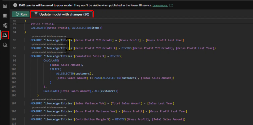
DAX Query View detects 50 measures before updating the model.
And Then Some Measures Fail #
Check out the video on YouTube at 18:40
Now, here is something that may look familiar if you have worked on a few Power BI projects.
A couple of measures fail because they reference columns that I removed earlier when I was cleaning the data. In itemLedgerEntries, those missing columns are:
documentTypedocumentNumber
So I go back to Power Query, find the step where I removed the unnecessary columns, click the gear icon and add those fields back.
A little later, I find that some measures also need two customer fields:
balanceDuecreditLimit
So I do exactly the same thing in the customers query and reload the model.
I still recommend removing unnecessary columns. But what we call “unnecessary” depends on the reporting requirements. At the beginning I did not need those fields for the relationships, but later some of my measures required them. So they are not unnecessary anymore.
That is quite normal. Data modelling is an iterative process and sometimes we have to go back and adjust an earlier decision.
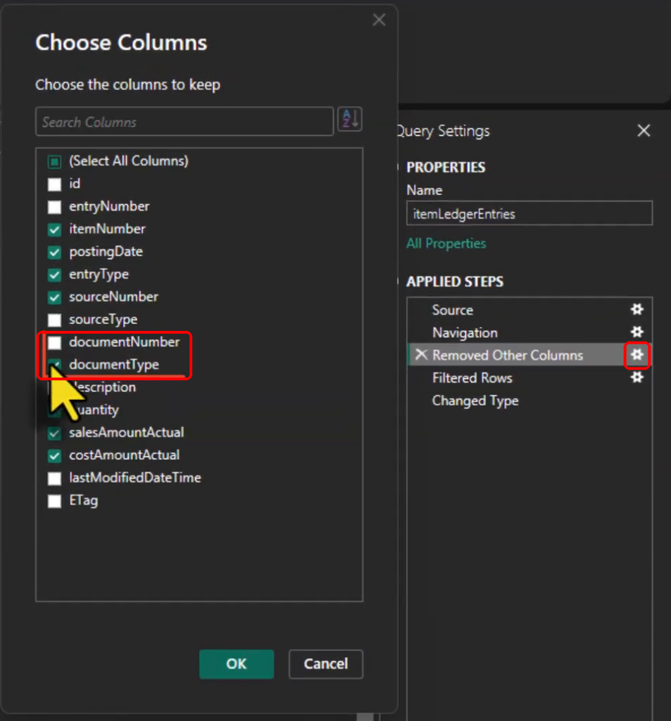
Reopening the column-selection step to restore documentNumber and documentType.
You can get the wider set of definitions from Power BI Sales Measures for D365 Business Central on GitHub. This is the file linked in the video description.
Using Copilot to Generate the Report Pages #
Check out the video on YouTube at 20:41
At this point the semantic model is ready and the measures are working. Now we can move to the report pages.
Here is something I mention in the video: I did not manually build all of those report pages from scratch.
I used Copilot in Power BI to generate the pages, then I polished the result to make it closer to what I wanted. For example, I changed the colours manually.
The working example shown in the recording contains the following pages:
- Executive
- Executive Trends and Risks
- Sales Performance
- Customer Insights
- Product & Category Analysis
- Growth
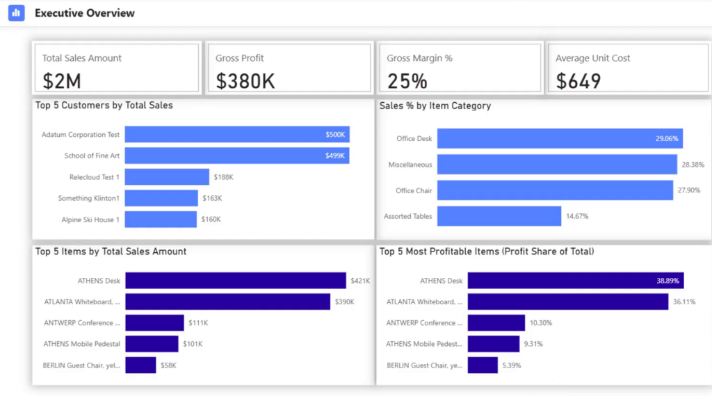
The Executive page after Copilot generation and manual formatting.
Running the Same Copilot Prompt Again #
Check out the video on YouTube at 21:36
Let me show you one more thing from the video.
To show the process again, I open Copilot in Power BI Desktop and paste the same detailed prompt that I used before. The prompt explains what I want on the page and which measures Copilot should use.
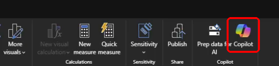
Open Copilot from the Power BI Desktop ribbon.
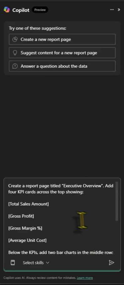
The original prompt specifies the page title and the measures for the KPI cards.
The newly generated page is close to the previous one, but it is not exactly the same. In this result, the category chart is placed below the customer chart, and the cards still need their number formats adjusted.
Some of the cards are similar and the Executive Overview title is there, but the result still needs some tweaking. Running the same prompt again does not give me exactly the same page in this demo.
Copilot can definitely save us time, but it does not mean that we click a button and the report is finished. We still have to review what it generated, validate the numbers, check the visuals and then apply the formatting and business requirements that we actually need.
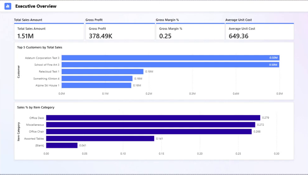
The new Executive Overview page generated from the same prompt, before manual formatting.
Wrapping Up #
Check out the video on YouTube at 22:54
The overall flow is not overly complicated once we understand the Business Central schema.
We connect Power BI Desktop to Business Central through the required API, select the tables that we need, clean the data in Power Query, keep the useful columns, filter the item ledger to sales, check the data types, build the relationships and then add a proper Date table.
After that we create the measures. If we have a larger set of definitions, DAX Query View can make that process much faster. Then, once the semantic model is in good shape, we can use Copilot to help us with the first version of the report pages.
For me, the most important point is still the same one that I mentioned at the beginning. The data model comes first.
Copilot can help. Nice visuals can help. Having 50 measures can help. But none of them can compensate for a model that does not represent the source data correctly.
Once that foundation is there, building useful Power BI reports on top of Business Central becomes a whole lot easier.
How do you normally approach Business Central reporting in Power BI? Do you use the Standard APIs directly, or do you stage the data somewhere else before it reaches Power BI? Please share your experience in the comments below. I hope you find this walkthrough helpful.
If you found this useful, you can follow me on LinkedIn, subscribe to BI Insight on YouTube, or follow the BI Insight podcast on Spotify. I also share updates on Bluesky and X, covering Power BI, Microsoft Fabric, AI, and the real-world data and analytics problems I come across along the way.
Discover more from BI Insight
Subscribe to get the latest posts sent to your email.
